Showing posts with label OUGD301. Show all posts

Wednesday, 12 December 2012

OUGD301 - Evaluation

-


Mitch Weaver
Evaluation – OUGD301


1.What skills have you developed through this module and how effectively do you think you have applied them? 

Throughout this module my main skill set that I have developed, is thinking visually. Working heavily on illustration and image-based design has allowed myself to start putting together a thorough strategy for the future. Working within different techniques, and challenging my existing ability has shown me that there is always a lot more to learn. Overall my weakness in this has to be the production side to creating pieces of design that exists physically. Generating work on screen can be easily achieved, but in reality it still needs to be three-dimensional. I feel that however, my type skills have massively improved, alongside my editorial design work. This is something I aim to continue to practice further, as eventually it shows my illustrative work in a more defined body of work.


2. What approaches to/methods of design production have you developed and how have they informed your design development process? 

Starting out with the hand drawn approach is something I always try to improve, although at times can be time consuming. There is a raw overall feel to each design/illustration that has allowed myself as a designer to start thinking about this within my practice. Overall production is something that I feel I am massively lacking in, as it seems to show towards the end of every brief. This is down to a few reasons, my financial situation, and personal life. Something, which I constantly try to improve. With that it has allowed me to understand how low-fi DIY can be successful and not expensive at the same time. This is what I want to capitalise on throughout the remainder of the year. Hopefully developing into a successful practice, keeping everything relevant to myself and design direction.


3. What strengths can you identify in your work and how have/will you capitalise on these?

The main strengths throughout my work are image based designs & illustrations. This is what I feel I am the most effective at utilising within each brief. As my rational states that I want to push this more throughout all of my design work, ultimately creating an almost double skill set. Using design with illustration and not apart.


 4. What weaknesses can you identify in your work and how will you address these in the future?

The most obvious weakness is my production process. Automatically I feel that each brief di not reach it’s fullest potential due to the lack of organization, and as already stated financial situation. At times I felt stuck, especially as I did not collaborate with any of my peers, making my work load a lot more difficult to handle at times. Not looking for excuses here, just how I see my weaknesses.

 5. Identify five things that you will do differently next time and what do you expect to gain from doing these? 

-       Production: Using this  throughout my briefs, to test my design work in the physical world and not leaving it all to the last minute.

-       Editorial: This is something I feel slightly more confident with in terms of designing work that can be seen through a book., magazine or publication.

-       Digital Illustration: Realistically this is the most efficient method to creating designs to be applied across a number of different platforms. Utilising this to it’s full advantage will allow myself to be more efficient and consistent on briefs.

-       Illustrative Type: This is was something I aimed to practice on, to aid my image based illustrations but I did not. This  seems to be the most effective method of incorporating type with image, within illustration.

-       Questions: Actually ask for advice, direction and help. I did not use the support effectively around the studio. Instead I worried about everything on my own. This is something I definitely need to take advantage of in order to successfully become a better designer within the course structure.

Tuesday, 11 December 2012

OUGD301 - Submission Boards

-
Final submission boards for all four briefs I have been working on this module. I have tried to keep them visually the same in terms of the bottom text and information, but change the layout to suit the purpose of the brief. These in themselves showcase my design work on almost professional scale, still need for some massive improvements and development in this area, but overall I feel they capture the project effectively. Not stressing too much on unnecessary pieces of design work.


Curses - Printed Vinyl / Poster

-
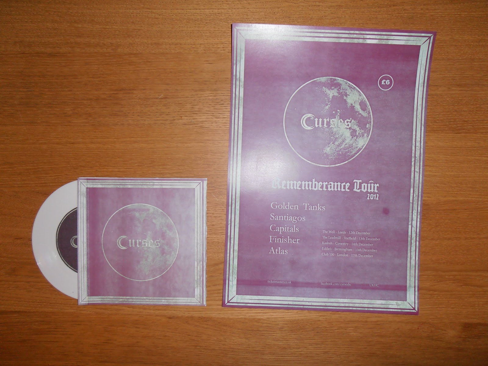
Initial photographs of the printed products for the curses brief. The photographs or prints do not do the project any justice themselves. This is something I need to work on within my own time management and skill set. These photographs are too poor to be put on my boards so I will not be using them. You learn from your mistakes.


Linaker Branding - Photographs

-
Branding photographs of the finished product range and printed media. Although I did not have time to professionally capture the design work. I have still managed to get okay images to work with on my boards and show the clients. As this work will be used I can continue to develop the products further and allow Karen & Dave a professional piece of branding they can utilise to their needs.


-


K.Linaker - Gift Voucher / Price List

-
Extended range, and a printed product that Karen herself wanted to be re-designed. Visually I have kept the same colour scheme throughout, typeface, logo and relevant content. Taking away the clutter from the existing design allows a cleaner, easier to establish piece of design. Suitable for her clients and her own needs as a businesswoman.


-


Eyedea - Printed Project + Range

-
The printed range of products and publication. Due to financial difficulty this term, I have had to make do with what I could. Limting myself in terms of production however, does have it's benefits. Low-fi, DIY methods of production has allowed me to realise what I can actually achieve on a low budget. The entire project has been printed through my own home printer, applying different stocks to further improve the visual output. All ink was black or grey, allowing the ink cost again to decrease.

Although If I did have a bit more money for printing and time, I would have screen printed these to allow a further increase in potential profit margins.


Eyedea - Digital Range


-
BOOKMARKS -

Further developing the product range of the publication and overall brief. I have created a set of additional book marks, with sections of my illustrations created for the brief. They can also be used as miniature prints, allowing them to be versatile in their purpose.


STICKERS - 

Everyone loves stickers, so again I have taken a set of my illustrations and created another addition to my product range. Each publication will come with a set of three, allowing a visual relation to the project and developing the brief further. 


Monday, 10 December 2012

Eyedea - The Final

-
The final publication for the Fishtank project. Overall I feel happy with the concept and design of the work I have created. Incorporating image alongside type, has allowed me to explore and develop my editorial skills. Initially my project was going to be based heavily on illustration, with not too much thought to using text. After much consideration it occurred to me that, at fist glance the illustrations would not speak for themselves outside of the context. Adding the lyrics to the content has allowed me to capture and develop the project even further, without any means of sourcing further information.

Using black as the primary colour has made it cheaper to produce and does not overcomplicate the images. I needed them to be visually easy to see and not disguised in anyway.


Eydea - Double Page Illustration

-

Another developed illustration for a double page spread of the publication. I have utilised type and image together to form a chaotic illusion of the overall feel of the album. As it speaks predominantly about love and it's stranglehold, with philosophical ideas of the future. I have captured this into a this image, without focussing too much on detail.


Eyedea - Book Illustrations

-
As I felt that the initial three illustrations did not make up enough content for the publication, I have taken another three tracks off the album and visually interpreted them into images. Again using the overlapping of two illustrations, speaking a focal point of the message of each song. Although at first glance the do not speak out their meaning. Alongside the lyrics, song and overall composition they sit effectively with Eyedea's spoken verses.

Wednesday, 5 December 2012

Final Crit Boards

-
Final crit boards. Not going to lie, there was no real direction with these at all, and errors can be seen all over the place. The type needs to be at a smaller point size and also the boards need to reflect my briefs, not just sit there without any visual relation. Saying that and realising my own errors will help me understand that I do need to put time aside to actually present and print my work.


Tuesday, 4 December 2012

Eyedea - Test Prints

-
The publication in print format. Although it is still not finished, I need to test how the pages are going to look in the flesh. Any type amendments of image rescaling can be calculated through this. A5 seems the logical and appropriate format to work with at this moment of time as it will allow myself to manufacture and produce it with a limited cost.


Eyedea - Layout / Getting there...

-
Starting to put the publication together, in order to develop an piece of work that ultimately will be printed. Taking into consideration how the page spreads need to be constructed, to reflect the content is something I am focussing with at the moment. Realistically it needs to reflect the mural outcome of the Fishtank brief, so with this I have began to overlap type with image. Also some of the pages will be double printed on tracing paper to allow a relation to glass.


Monday, 3 December 2012

Eyedea - Type & Layout 1

-

COVER LAYOUT.1 - 
Quickly putting together potential cover designs, utilising one of my existing illustrations as the focus. Although after playing around with the image, I want to keep it away from being a focal point. And keep it under wraps as the publication is developed further. Placing the illustrative type designs as the central point of the cover will allow an intrigued interaction with the audience. Hopefully...


-
 TYPE MANIPULATION -

Taking an existing typeface (Organon Sans Light) I have began experimenting with different approaches of manipulation. Making pieces of type that are illustrative based to fit with the images created for the project. This has also massively improved my overall understanding of constructing and changing the way letterforms can look.


Curses - Colour Covers 2

-
During these examples of cover designs, I have applied a texture to increase the visual output of the potential resolution. Within photoshop I have then experimented with various colour schemes, and print processes. Using duotone has allowed me to create a piece of work focussed around 2 colours or potentially 1+ stock.


The Fishtank - Eyedea & Type

-
A few pieces of design work for the final artwork, with these I have experimented with colour. Positioning of type, and the overall layout of each poster. A particular colour scheme is yet to be focussed down, but this is giving me and idea of how a final outcome could look like. Visually they are lacking in focus and I feel that the ampersand is too overwhelming and takes of the entire illustration.


-

Curses - T-Shirts

-
T-shirts / merchandise, significantly one of the most important pieces of product that any band uses to build profit and also an audience. To keep the general aesthetic flowing, I have followed up the existing aesthetic and applied it across a range of potential designs. Matching the colour of t-shirts to the design work already created, will again furthermore develop the visual consistency. Although if the t-shirts were going to sent into production, they would have to custom made. Unless sourced out from a wholesale company. This could increase the initial costs, but also boost the profit margin in the long run.


Curses - Tour Ticket / Sticker

-
Again taking the existing visual aesthetic throughout the the project range, I have began to apply it tickets and stickers. Creating a collection of various different products will allow and increase of design work, and also the project as a whole. I feel that visually everything is coming together nicely now.


Curses - Poster / Vinyl Cover

-
Unfortunately I have only just realised today that Curses have actually broken up, three weeks ago. So that has put a downer on my project, nevertheless I'm still going to carry it on. Although it will not actually go into use now, it's still practice into the field of design I want to focus in.

The poster below and 7"vinyl mock shows the design direction I am heading with this brief. Looking back at the photocopy, DIY approach I needed to focus it more around structured graphic design instead of hand made. Saying that I am still going to use the idea of low-fi production with this to see how I can effectively reproduce a product on such a small budget.

The actual design of these products has been put together with a visual consistency, important through any method of PRD. Also there is only two colours throughout, making it more accesible to manufacture and in the long run inexpensive, hence my previous point.


Linaker - Type Amendments

-
With the feedback given I have put together the relevant information and incorporated into the needs of both Karen and Dave. Although I find working with type difficult, I managed to get some feedback from mooney who helped me sort out the presentation of text. With that these amendments are going to be spread across the brand range.