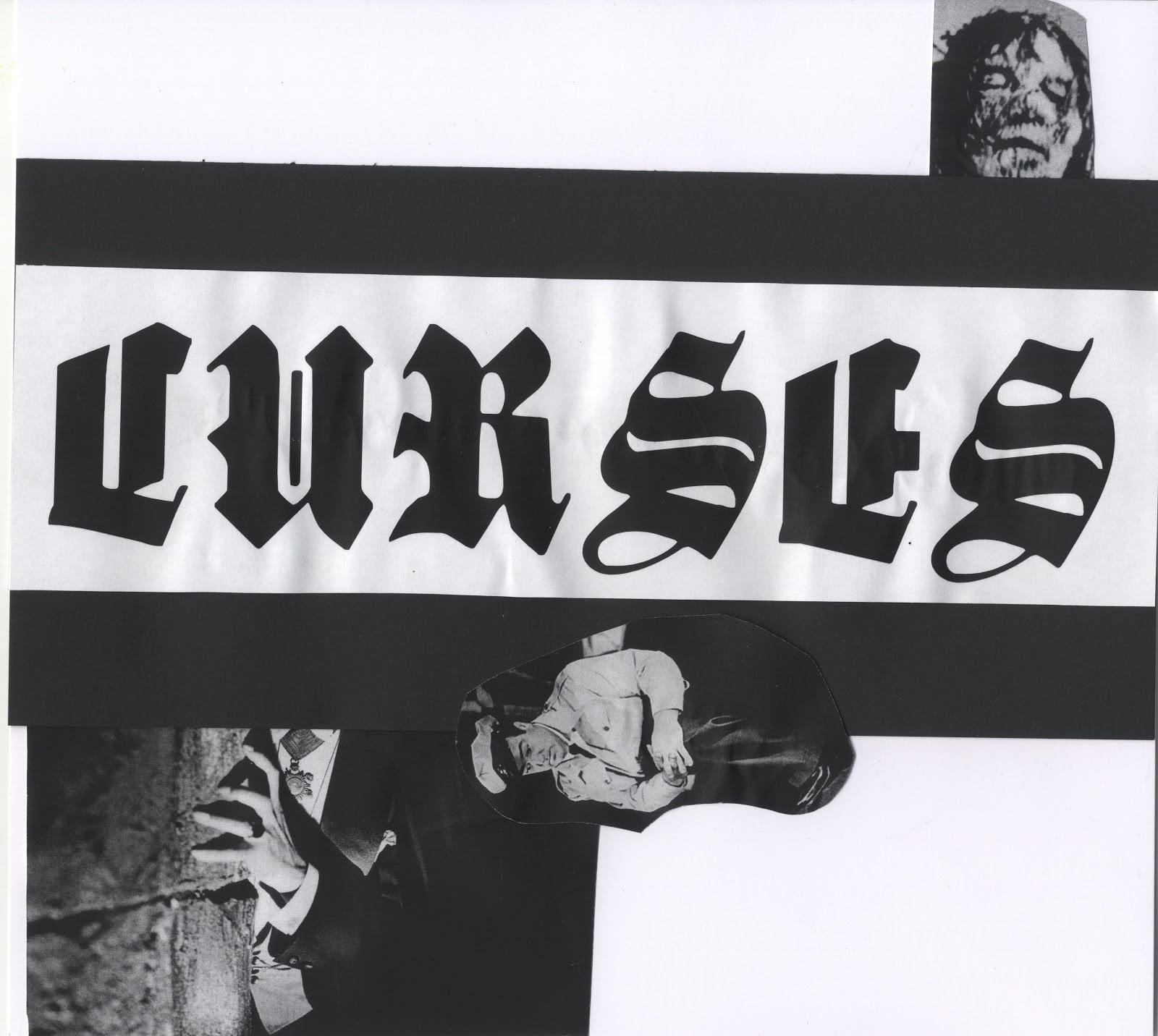
Spent the afternoon/evening starting one of my other briefs. I need to get a move on with these as I don't want to rush it at the end and put together something scrappy. As the brief is designing album artwork, t-shirts & promotion for a local hardcore band Curses. I automatically have built up knowledge to exactly how the aesthetics should be.
With this I experimented with an old school approach to design work. D.I.Y within hardcore/punk music is one of the most defining aspects to the genre and something that still stays strong today. As you can see I have used blackletter typework with overlaying black & white imagery, as this is the easiest way to produce design work for the culture.
-TYPE
Blackletter, gothic style fonts are something I find the most appealing to myself as a designer and with my existing typefaces I have downloaded I put together some examples to use to create initial ideas for the brief.
All of these images do not belong to me, I have quickly put together a few pages of different visuals focussed around the theme of 'curses' and what I see fitting. Vampires, ghouls, monsters, graveyards, zombies etc.
RECORD COVERS
Cut and paste mock up covers, initial ideas and design direction for the brief. I have found this particularly exciting as I want to incorporate the fundamentals of type, layout and image and incorporate them into an old school approach to design. After all there is nothing better than creating something with your hands.


-
PHOTOCOPIES
No comments:
Post a Comment