Showing posts with label RESEARCH. Show all posts

Wednesday, 25 January 2012

Top Ten - REFLECTION

After this mornings short briefing, I came to realise what I actually need to do to get everything done for the motion graphic. Considering the research I have collected, allowed me to look back and focus on exactly what it is I am trying to achieve.

N
 O
  T
    E
     S - 


INITIAL THOUGHT -

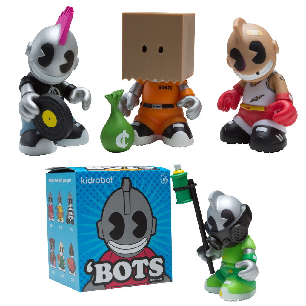
The main focus of my project now, is to promote 10 munnyworld customisable toys. This seems like the easiest option as of now, that would allow me to start moving on with the project. As there content already exists, it would just be a case of collating the information and converting the projects into hand rendered / vectored artwork.


- MUNNYWORLD CHARACTERS


- FAT CAP SERIES


- YUMMY


- KIDROBOT BOTS


- KOZIK LABBIT

Realising that there are already at least 10 existing styles of custom toys, created by kidrobot or collaborations with artists. I now have a set of visuals to work with. Although I do not want to rely on photographs too much as I feel it wouldn't fit the style of animation effectively. 


Thursday, 12 January 2012

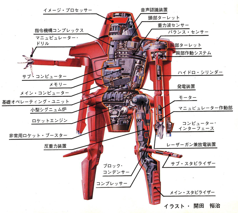
Existing Japanese TOY DIAGRAMS

To build up my knowledge and research base, I have began to look at the bigger picture, to understand fully the culture behind Japanese toys. As Gundam plays an important role within the society, alongside other collectable figures. It occurred to me to turn my direction towards understanding the principles behind that.


-
The diagrams listed below are from various periods of time, each detailing specific components from technical drawings. What I find even more interesting is the language used, as it is just as visually appealing as the imagery itself.


TOY DIAGRAMS -


Wednesday, 11 January 2012

GUNDAM: Papercraft

Papercraft is used for a number of modelling techniques, more so for creating toy sculptures. The idea is  to replicate each part to the structure, allowing you to building your own three dimensional piece of work. These examples are increased versions of smaller models, what is interesting is how visually stunning they look in comparison to the plastic versions. 


EXISTING EXAMPLES OF PAPERCRAFT - 


Tuesday, 10 January 2012

YEAR ZERO

MAIN TITLES -


Really interesting and extremely well transitioned piece of film & animation. Each key frame is thought provoking and takes a step back from the reality of certain parts, for example the main recorded scenes within a working physical space. Aside that, the animation sits extremely well, embedding a whole new concept as the viewer/audience interact. The feel is impressive throughout, emerging you as a conveyer of the clip bringing you a sense of panic and depression. Fantastic. 


ABOUT - VIMEO


'' 2D Interns: Mathijs Luijten, Per Westholm
Compositing: Chris Staves, Ivor Goldberg, Adam Janeczek, Matthijs Joor
Graphic Designs: Si Scott
Additional Graffiti Elements: Florian Stumpe
Matte Painting: Wieger Poutsma
Additional 3D and Compositing: Storm PostProduction


Production (Prague) by Savage:
Executive Producer: Klara Kralickova, Pavla Burgetova Callegari
Producer: Michaela Berkova
Production Assistant: Vojta Ruzicka
Prop master: Jan Fiala
Location Scout & Management: Petr Bastar, Adam FFollowing in the footsteps of Prologue Films and The Mill, PostPanic have created this year’s prestigious opening titles 'Year Zero' for OFFF Festival 2011 in Barcelona offf.ws/bcn2011/


Written by Mischa Rozema and British graphic designer, Si Scott, the opening titles reflect their dark thoughts on a possible future. Directed by Mischa and shot on location in Prague, the film guides the viewer through a grim scenario embedded with the names of artists appearing at this year’s OFFF festival. The live action was brought back to Amsterdam for post, primarily carried out by PostPanic’s in-house team of artists but also with the additional help of freelancers and partner companies that we have enjoyed strong creative relationships with over the years. It’s really fair to say that this was a labour of love by a passionate crew of people.


DIRECTOR'S NOTES (By Mischa Rozema)


This project started out as a collaboration between myself and Si Scott. Right from the start, we decided that it should be the darkest thing we could make. I think it just felt natural to the both of us; if we had to nail the future, it would not be a nice place. 


This idea evolved into a clash of times. Inspired by an idea from the late Arthur C. Clarke. He wrote about different historical civilizations meeting in a single point in time. So what happens when civilizations meet? The 'weaker' one gets eaten by the 'stronger'. You only have to look at history to see the destructive power of civilizations. 


So the main underlying idea is: what would happen if the future lands on our doorstep today? Let's take mankind, add perhaps 100 years and then let them show up on our doorstep today. The future would pretty much devour the present. Probably in a matter of, let's say, 7 days… So that's what we're looking at. But every ending also means a new beginning, hence Year Zero. 


There's all kinds of hidden messages in there. Like the virus eating away at reality, buildings and people, even at the viewers brain. It's behaving off course much like a computer virus. And the network of wires represents the future of social networking. I just made it physical and let it 'catch' the city and it's people like a net. All these ideas just serve as inspiration for us to create a future that worked for this concept. They're not meant to be deciphered by the audience. It's still meant to be just a title sequence and not an actual movie.


Now what makes a good title sequence? Personally, I think it's something that gets you in the mood, warms you up for what you're about to experience, be it a film, tv series or in our case, the OFFF festival. We decided to treat the OFFF festival as a feature film experience. So all we had to do was get the viewer into the right state of mind. Without, of course, being too narrative led. The best title sequences out there are nothing but a random collection of images/scenes that don't tell a lot if you watch them on their own. But edit them together and a new context is created. A context that matters, a feeling that gets the viewer ready for the main event, in our case, the festival.


To get started, the next thing we did was make a collection of ideas that would scare me and Si. So, anything drawn from our youth, right through to stuff that's inspired us over the years as well as seemingly random compositions that trigger the imagination of the viewer. For example, when we show you the aesthetics of a car explosion, it's carefully constructed. Why a car and not something else? Because an exploding car brings extra content to an otherwise simple aesthetic display of violence. A car doesn't explode by itself so instantly the brain tries to formulate the background behind it. It adds an either political or criminal edge to the violence. To me it felt appropriate because of the sense of protest and rebellion the shot has. And maybe the biggest question; was there someone in the car and if so, who was it? For me, every idea should provoke these kind of questions; from a girl in a prom dress holding a rocket launcher to a riot cop standing in the kitchen. All scenes have a pre and post story to them. In no time you're actually trying to connect these seemingly random scenes and boom; you've just created your own strange context. You now have a feeling, a taste and lots of questions probably. Questions that normally would be answered by watching the actual movie. But since there's no actual movie here we'll leave stranded with, hopefully, an uncomfortable feeling and lots of questions - some might feel unsatisfied and wondering why. Just like a nightmare.


We also wanted the actual titles to be different this time. Most of the time festival titles are driven by the idea on how to show titles. A mechanism that displays titles in a creative way. We actually thought to bring the festival theme to the foreground and have the titles play a part in it. Incorporate them so they become the actual fiber/texture of the piece itself. Practically I still think it's nice that the viewer has to actively look for the names and not get too comfortable. Even if it means to see it a couple of times which surely is the best we can aim for as a free project ; )


How about the shoot? Well, prior to Prague we created more than 50 ideas I could play with. This was always the intention. Go out shooting with a tiny crew, acting like we're still in art school and be open for anything that might happen. That's why we shot everything on 2 Canon 5D's (that and having no budget off course). This was a really nice change for me. Normally I prepare commercial shoots to the very last detail and there's a lot more people involved. Savage helped us out big time in Prague. We also had some bad news. Due to his back problems Si Scott had to abandon the project and couldn't join the shoot.


When we came back from Prague I started editing straight away and soon came to the conclusion we had about 60 vfx shots to work on and no budget and increasingly less time. Remember that this project was a side dish for PostPanic, we had to work on commissioned jobs also. But everybody involved soon fell in love with the project, including STORM Postproduction who are our neighbors (luckily for us).


In the mean time we received the title list. It had about 70 names on it! That's when I found out that the dynamics I wanted to use would probably not work. Just too many names that would make the piece too long to just show random images. So in the plane towards Prague I thought of bringing in a tiny bit of narrative. Which turned out to be the beginning of the sequence (1st act). I wrote in a lead character that would relate to the viewer. 


The idea was to trick the audience into thinking they're watching some kind of documentary. We basically follow a guy going home. Bit by bit his environment gets stranger and more uncomfortable to watch. Is he living in a war zone? Slowly the background takes over and the piece changes into an urban nightmare. And like a nightmare, the story/edit doesn't always make sense but makes you feel really uncomfortable. I also wanted the viewer to experience the nightmare. That's where the dark matter comes in. Dark matter is what I call the macro shot bits. Flashes that derail your train of thought like there's something eating away at your brain as you try to make sense of the nightmare. I wanted the viewer to go nuts, alongside with the cast. Erase the line between nightmare and reality. The end result is something you won't come across easily on your tv. And is also just another fun way to do titles.


The sound design and music made by Hecq added a lot to the feel and scale of the film. It clearly divides the 3 acts (1st act: up to execution, 2nd from execution, 3rd final shot) and makes completely different ideas and scenes feel coherent. It also emphasizes the dynamics of the film and brings the much needed pace at the end. It's been great working with Ben. We've been surfing the same wave length throughout the project.


Finally I want to thank everyone involved for making these titles possible. For creating something out of nothing. For showing so much love for something as dark as this.


CREDITS

Directed by Mischa Rozema
Story by Mischa Rozema & Si Scott
Production Company: PostPanic
Executive Producers: Jules Tervoort, Ania Markham
DoP: Jiri Malek, Mischa Rozema
Music & Sound Design: Hecq
Senior Producer: Annejes van Liempd
Production Assistant: Jacinta Ramaker
Production Designer: Roland Mylanus, Nicole Nieuwenhuis
Editor: Mischa Rozema


Prague Cast:
Main Hero: Vladan Bláha
Grafitti Guy: Tom Malar
Main Hero Sister: Katerina Galova


Post-Production: PostPanic
CG Supervisor: Ivor Goldberg
VFX Supervisor: Chris Staves
3D Artists: Jeroen Aerts, Matthijs Joor, Jurriën Boogert, Marnix Reckman, Adam Janeczek
2D Artist: Erwin van den IJssel
3D Interns: Cara To, Xander Clerckxuchs
Location: CREVISTON, a.s.
Tattoos made by: Wowa tattoo prague


About OFFF Festival 2011


OFFF is an entity in continuous transformation, alive and evolutionary. More than a decade ago, it was born as a post-digital culture festival; a meeting place to host contemporary creation through an in depth program of conferences, workshops and performances by the most relevant artists of our time. 


These days, OFFF keeps being a reference event throughout the world. A festival hosted in Barcelona, New York, Lisbon and Paris which has featured renowned artists such as Joshua Davis, Stefan Sagmeister, John Maeda, Neville Brody, Kyle Cooper, The Mill, Digital Kitchen, Ben Fry & Casey Reas, Golan Levin, Chris Milk, Rob Chiu, Julien Vallée, Paula Scher, Rick Poynor, Erik Spiekermann, Dvein, Erik Natzke, Vincent Moon, Ze Frank, Alex Trochut, among others…The festival where a new generation of artists has originated and developed. All of them started attending OFFF as spectators. Today, they take up its main stage. ''

GUNDAM

WIKIPEDIA- DEFINITION 


The Gundam Series (ガンダムシリーズ Gandamu Shirīzu?) is a metaseries of anime created by Sunrise studios that features giant robots (or "mecha") called "Mobile Suits" (MS); usually the protagonist's MS will carry the name Gundam.
The metaseries started on April 7, 1979, as a serial TV show called Mobile Suit Gundam. That first TV series has since spawned a franchise that has come to include works released in numerous media. Titles have appeared in the form of multiple television series andOVAs, movies, manga, novels and video games, among other modes. The story from the original 1979 series has been considerably extended with sequels, prequels, side stories and alternate timelines. As a result, the title Gundam has become a collective term for the seven distinct but related timelines that can be pieced together from the stories that appear in the Gundam franchise. Generally speaking, the timelines do not intersect, but they do contain a few common elements such as the titular war machines called Gundam. However, allGundam timelines and worlds, long after their own anime series, do eventually intersect and combine in the series Turn A Gundam.[1][2]
The original timeline for the Gundam series was the Universal Century (UC) series, which included Mobile Suit Gundam (1979) and Mobile Suit Zeta Gundam (1985). Since the 1990s, alternative timelines have been produced and developed, including the Future CenturyAfter ColonyAfter WarCorrect CenturyCosmic EraAnno Domini and Advanced Generation timelines.
As of January 21, 2008, the Gundam franchise is a 50 billion yen trademark.[3] A year 2000 press release stated that retail sales of Gundam items had totaled $5 billion.[4] In the 2008 ranking of average sales figures for anime copies sold in Japan (1970-2008 total sales figures averaged by episode), Gundam series were in four of the top five places: Mobile Suit Gundam ranked second, with Mobile Suit Gundam SEED Destiny third, Mobile Suit Gundam SEED fourth, and Mobile Suit Zeta Gundam fifth. Also, Mobile Suit Gundam Wing ranked 18th and Mobile Suit Gundam ZZ ranked 20th.[5] Gunpla's (Gundam Plastic model) holds 90% of the Japan character plastic model market.[6]
Academics in Japan have also viewed the series as inspiration, with the International Gundam Society being the first academic institution based on an animated TV series.[7]


VIDEOS / MOTION GRAPHICS / ANIMATION - 


The important aspect in all of these features is to recognise the scale of each model, wether it is in physical format or created in a three dimensional space. This allows the audience to fully understand what they are there for, a purpose. To protect.


--

7ft Paper craft model of a Gundam robot. This is absolutely incredible. Bringing to life a re-scaled piece of modelling into a whole new narrative. Creating a wider visual space between the audience and context. Expertly crafted and precision engineered, creating a thrilling atmosphere of intent.


ILLUSTRATIONS / PHOTOGRAPHS / SCREEN SHOTS - 


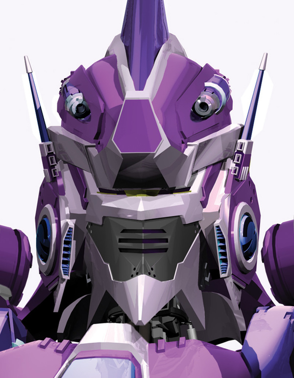
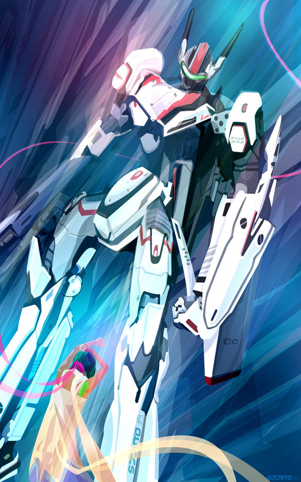
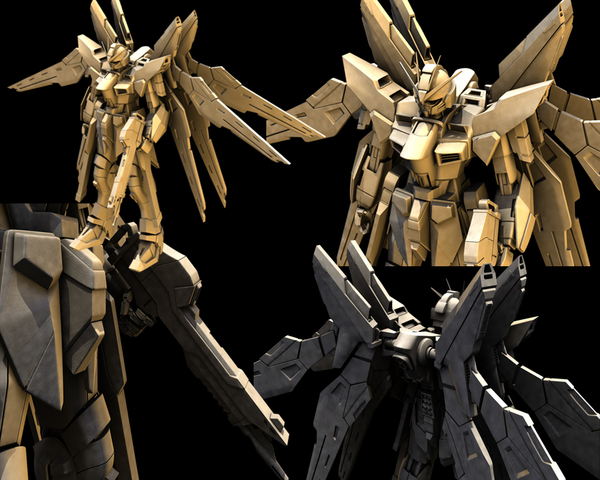
A collection of different pieces of artwork used in different media to create Gundam robots. Wether it is based in 3D, physically drawn or vectorised Illustration. Photographs of existing pieces of physical design work could also be effective in influencing my design structure.


TOY GUNDAM - 

The most impressive part to the design created, has to be the craftsmanship gone into building a three dimensional model base. As you can see there are stunning pieces of imagery, each creating a world of depth from view. 


SUNIL LIMBU 

--

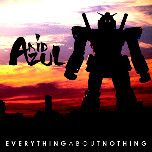
KID AZUL - 

Interesting album artwork, featuring Gundam and Power Rangers. Obviously it relates to the artists interests or even style of music he has gone for. Again I like the use of context used to create this piece of work, as it demonstrates a visual understanding of how the audience would receive the album.