A COLLECTION OF COLLISION GRAPHIC MOTIONS:-
It occurred to me that, if I decided to create as many possible examples of collisions, that replicate those that could be particles, I would be able to incorporate a hidden meaning, another identity. Visually relating the word to a series of events will allow to me understand a critical concept.
The videos are as followed -
LHC.OLISSION
Development:- The bottom video is a more defined a developed motion of the idea. Although there is an extra second included, rather than it being five. The motion now has a start point and an end point, which seems to tie the graphic motion together.
SPECTRAL
The main principles involved in this motion rely on use of gradients and 3D type in order to create a direction movement that can be easily apparent across the screen. Although I need to somehow incorporate this sequence into a more reliant flow, that way the start point will reflect the end point. Potentially this motion could be effective if I develop it further.
Showing posts with label SILENT. Show all posts
Showing posts with label SILENT. Show all posts
Monday, 9 January 2012

COLLIDE: Test One
COLLIDE COLIDE
To gather a broader range of how the type could react once imported into After Effects, creating a 3D piece of type seems like a good option to experiment with. By doing this I can now use cameras that could ultimately orient and change to perspective of my whole piece of graphic motion.
The examples below are rough outlines of how different colour ways can change the overall feel and outcome to each letterform. Using gradients have allowed me to create a much deeper feel to a piece of type as now the positioning of the angle of colour creates an almost metallic effect. This could be useful as I want to somehow experiment with using a car crash collision, without the use of Illustrative material.


PART ONE
To begin with, my first thought proces is to be able to understand a the process building up the pace on a certain aspect to the sequence. By being able to understand this clearly, I am now able to start creating a piece of work motion that could potentially use the principles of four dimensions.
The idea behind this motion, is to create a personification almost, of racing cars. Be reenacting elements to the changes that occur and what would happen in a car collision.
The next part to my process is to move on and create a better dimension and understanding of the race itself.
Sunday, 8 January 2012
SNAP: Test 2
SNAPPING SERIF
The main idea throughout this idea is to show a graduation of the typeface/letterform building up into a serif typeface, from a sans serif. Alternatively I am going to play around with different aspects and points of movement to get an overal feel of how the word snap, can be visually incorporated.
TYPEFACE:- ROCKWELL ITALIC / 300pt


To create an understanding on how different colours can affect the mood and overall composition of the motion, I have selected a few different colours from the Pantone colour books. Although you can see that a lot of them don't really demonstrate anything to do with snap, the idea is to see which colour fits accordingly to the overall design through creating a subtly of movement on screen.
COLOURWAYS:-
* Pantone Pastel Uncoated
* Pantone Solid Matte

TEST VIDEO:-
There isn't anything particularly interesting at all about this motion, saying that I do like how I have detached the serifs from the letterform creating a whole new typeface without realising. There are many adjustments that I need to look into sorting out, changing the time flow, which will create a smooth piece of animation. Also the 'SNAP' word is positioned all too stationary, I need to allow it to freely move somehow...
Thursday, 5 January 2012
Silent Movie - SNAP Motion One
SNAPPING SNAP
At the moment I'm trying to see how an idea can work within After Effects. This is the first graphic motion I have created that reflects and represents 'SNAP'. Although nothing is perfect of completely defined. As there are some slight errors throughout, the main problem being flow. It doesn't seem to react well enough with the manipulations taking place. This however can be changed.
I'm planning on creating more motions with the same idea, but more focussed and different outcomes. Also colour needs to be applied more effectively, saying that I think the colours chosen work quite well together.
At the moment I'm trying to see how an idea can work within After Effects. This is the first graphic motion I have created that reflects and represents 'SNAP'. Although nothing is perfect of completely defined. As there are some slight errors throughout, the main problem being flow. It doesn't seem to react well enough with the manipulations taking place. This however can be changed.
I'm planning on creating more motions with the same idea, but more focussed and different outcomes. Also colour needs to be applied more effectively, saying that I think the colours chosen work quite well together.
Monday, 2 January 2012
Silent Movie: SNAP / Type Development
Currently I am in the process of developing pieces of type that could ultimately be used in After Effects to create a piece of graphic motion. The main idea of this process is to see what works with each word and how I can manipulate the letterform effectively, using Illustrator.
SNAP -
1 > For this set of letterforms, I'm currently creating a slow graduation of displacement from different letterforms in order to create a 'snap' feel throughout.
FUTURA / MEDIUM / 250pt


TEST ONE - LETTERFORM 'S'
Tuesday, 13 December 2011
Monday, 12 December 2011
TYPE: Test Pieces
To gain a better understanding on how the motion might be put together on After Effects, I've started playing around with letterforms to start generating potential visual ideas that can be used for the motion graphic. Although none of them are final as of yet, I'm starting to develop my understanding on the practice.


Studio Workshop: Detailed Key Frames
The basis of this workshop was to take five of the ideas we had previously created and generate more detailed versions, illustrating the whole idea through a number of frames. To be effective in visualising the idea I had to select frames that would either show an example of a time frame ( e.g 1.5-2.5 secs ) or create a whole sequence across a page.

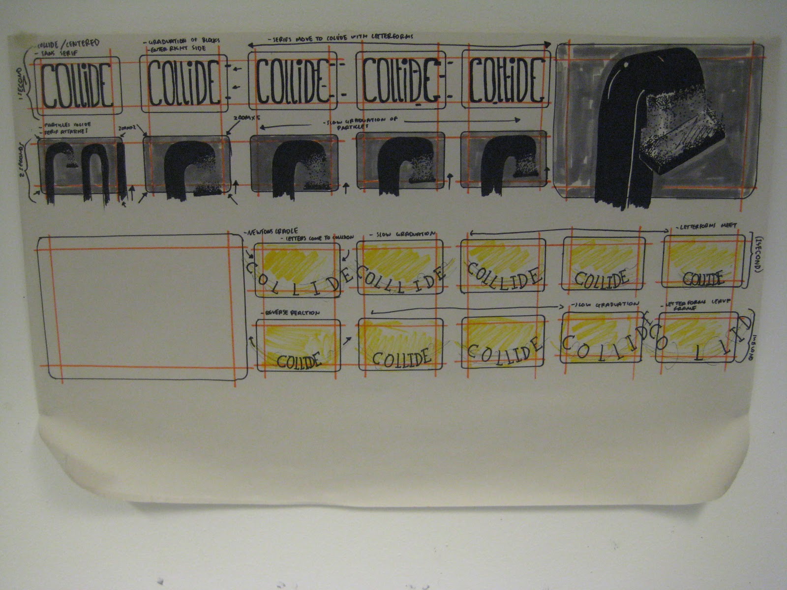

I found this extremely useful as it has helped me understand how I need to visualise my ideas more effectively in order to create the biggest effect I can through software. Good practice with my drawing skill too.
Tuesday, 6 December 2011
Seminar TWO: Timelines / Key Frames
Today's seminar was focussing on the basic approach to storyboarding and how to break down a specific amount of time into equal length time frames. Although it was quite confusing at first, I managed to work it out with out any confusion and easily understood the task.
THREE SECOND INTERVALS/ TWENTY FIVE FRAMES -

TIMELINE OF SEQUENCIAL KEY FRAMES -

STORYBOARDS: Extended Ideas
The focus to these storyboards were defining each sequence, so it appears as a more accurate visual interpretation of how the motion could possibly look. By doing this I am able to gain a clearer understanding of how an idea could become a visual on screen.
SNAP-


Monday, 5 December 2011
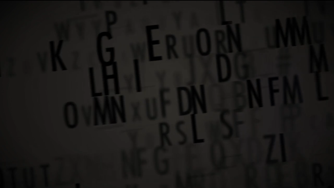
25 FRAMES: Screen Grabs
For this task, I've chosen to use a motion graphic that animates a part of speech from the War of the Worlds broadcast in 1938 by Orson Wells. As the motion graphic is 1:15 seconds in length, makes each screen grab at a 3 second interval.
\
TWENTY FIVE FRAMES // THREE SECOND INTERVALS


\
TWENTY FIVE FRAMES // THREE SECOND INTERVALS


Sunday, 4 December 2011
STORYBOARD Development: Studio Seminar
These were the outcomes to the first seminar on the module. From the research that we had collected prior to this session, we had to use pieces of typefaces (letterforms) in order to start producing our sequencial storyboards.
From this, I now have a collection of initial ideas and visual starting points, to understanding how I could possibly construct my own piece of kinetic typographic motion graphic.


From this, I now have a collection of initial ideas and visual starting points, to understanding how I could possibly construct my own piece of kinetic typographic motion graphic.


- HELLO THERE!
Wednesday, 30 November 2011


Subscribe to:
Posts (Atom)